par Vanina Henry
There are extraordinary choices of wallpapers, they used to be a basic decorative element, forgotten today by some who seek minimalism with white walls.
As an interior designer, I cannot consider a project without incorporating a wall covering. I recommend it to enhance a wall, to contrast a particular space. It can be used anywhere without limit.
Wallpaper designers are constantly coming up with new manufacturing techniques, designers are inspired by art offering us a sublime choice of colours and patterns.
Harmonise your interior with materials and colours
The hardest part is the choice, you have to create the colour concept and be seduced by the covering that speaks to you the most.
Often, when I choose a wallpaper for a client, I have to go through entire collections before I find the ONE that fits and only the feeling, the little voice inside dictates the right choice.
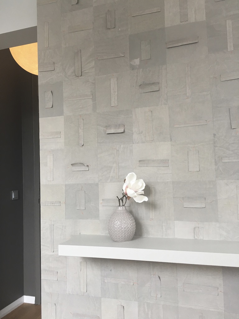
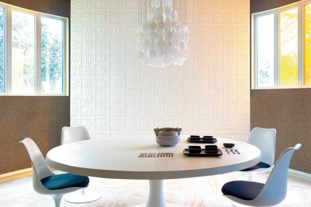
Projet interior design Vanina Henry
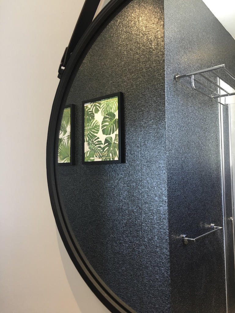
Wallpaper in a bathroom, Vanina Henry project
MAKE YOUR HOME LOOK GOOD
Dare to use patterns and colours for an entrance, an opening on a room to create the WOW!
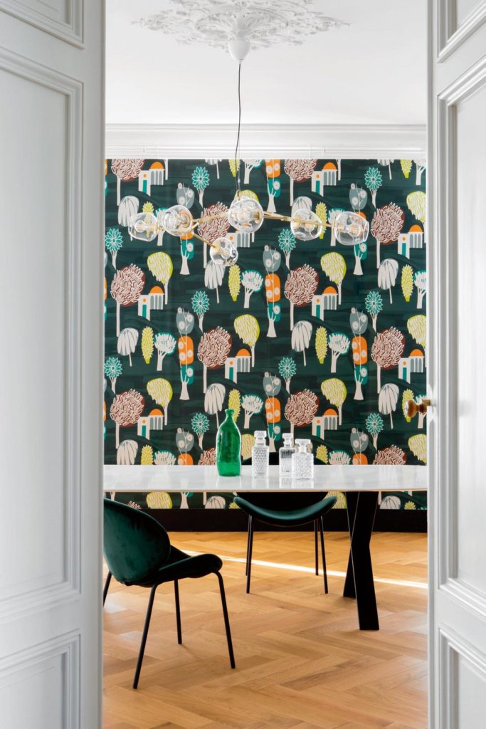
You don’t dare to use a pattern? From experience, I can say that you are never disappointed with the expected result.
Are you afraid of getting bored with it? Then, like the seasons, you can change it and move on to new horizons!
When it is time to choose the colours for your interior decoration, it is often necessary to start from a determining element to build around its coloured harmony.
The clients who come to see me are a bit lost when faced with this task, either because they like everything and don’t know how to visualize a harmony, or because they have the idea of a desired style but don’t know how to concretize it.
It is then necessary to adapt the coloured construction in relation to an existing element, a painting, a piece of furniture in particular or an inspiration taken from a decoration magazine for example.
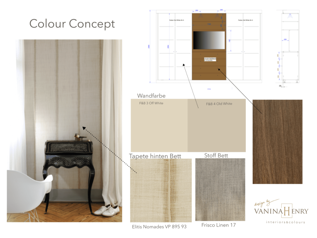
Here in this project, it is a room for a man where each material is a colour. For the coloured creation, we decided to stay in a neutral, timeless harmony.
The wallpaper will be placed behind the bed and the tone of its linen fabric will match it perfectly, so that the eyes and the soul remain relaxed. We have carefully chosen the colour of the wood in the custom-made wardrobe to match the rest of the woodwork, which has been lacquered with Farrow&Ball 4 Old White and the walls painted with Farrow&Ball 3 Off White.
From neutral colours
That’s right, it’s chic!
Stay in the same tones without going overboard…
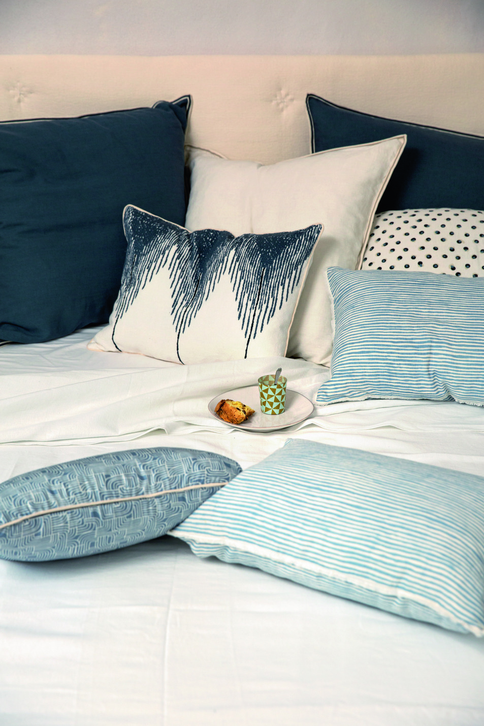
ELITIS cushions
Here, for example, it is deliberate to keep the harmony in a declination of blues on white.
For a calm effect, we play with materials and patterns.
Contrast with subtlety and character…the proportion of colours.

ELITIS Rugs
Dominant colour, dare to use daring contrasts with materials and styles, there is no standard in colours, that is for sure. Look at the paintings of artists who use colours without parsimony.
Here, what pleases is the proportion of the colours. The dilapidated wall sets the tone and calls for pink, so why not contrast it with bright red to surprise. The black of the carpet binds the whole with aplomb. With the green of the plants we just feel good.